Mittwoch, 22. Oktober 2014

Chapter 9:
Decorative  papers:

My choice of  the  color scheme is blue, green, turkise, magenta and silver white. All the colors are in different ranges from light to dark tones.

Color symbolism:
The color blue is the coolest and most calming of all the colors. It represents the water and the sky. In Christianity the color blue becomes the symbol of the Virgin Mary. I like a deep blue as it is a enjoyable color.

The color red/ magenta represents universal harmony and emotional balance. It is my second complementary color in my color scheme. In the meaning of colors, magenta represents universal love at its highest level. The color magenta is a color of cheerfulness, happiness, contentment and appreciation for what you have acquired and achieved.

The color white contains an equal balance of all the colors of the spectrum, representing both the positive and negative aspects of all colors.
The color silver has a feminine energy, it is related to the moom and the ebb and flow of the tides. It is the color of illumination and reflection and modern hi-tech.

Picture 73:
My used stemps for making the next papers.


Picture 74:
A range of blue papers.
1: the basic is made of water color and than stemped with acrylic dark blue and silver
2: a sheet tracing paper was rubbed over cartridge  with oil paint stick and than a wash blue of diluded acrylic paint
3: acrylic paint was applied with a sponge and than I used a brayer with silver acrylic paint to make a  pattern.
4: rubbing with a candle by using my stemp and than blue wash with Brusho paint
5: the same technic as No 4 only using Procion
6: painted Bonda web was applied to a sheet of paper
7: the first layer was painted with Procion and Brusho, stemped with bleach
8: it was painted with Brusho, stemped with acrylic
9: a light wash of water color paint and than was salt applied
10: tissue paper was used. The linol stemp was rubbed by oil paint sticks. After drying a color wash was applied
12: different blue Procion colors and a little bit red was painted and than I applied salt.
13: two colors of Brusho were applied
14: crumpled brown paper was put in a bath of blue Procion for a short time, after drying it was ironed.
15: On a plastic bubble wrap was glued a layer of painted tissue paper.


Picture 75:
 -First row from left to right:
Procion color with salt
Brusho
water color paint with salt
the first layer was done by candle wax and than blue ink
-Second row
a thick layer of different green and blue colors was applied on a sheet of paper, a brayer was rolled over to get the bubbles
different water colors were applied with a brush
the first layer was done by drawing spirals with neo color 2. A layer of silver was layed over, at last I used a brayer for making the bubbles
I made marks with a candle wax, sprayed water on my paper and than blue and light green Brusho was applied


Picture 76:
I have made marks with masking paint and than I painted with brush after drying I removed the masking paint
water paper was sprayed with magenta paints and than was applied a layer of salt
making marks with candle wax and it than was painted by Procion
the wavy lines were made by oil paint sticks and than painted with Brusho
the first layer was water color paint and than stemped with a round sponge acrylic paints in red, blue and silver
oil paint sticks were rubbed over cartridge paper


Picture 77, 78 and 79 are examples to my black and white papers. These are exercises for   the developments of my designs. These are my warm-ups to get an idea of the harmony with the different forms.

Design into full color:


Picture 80:


Picture 81:


Picture 82:

Freitag, 17. Oktober 2014

Chapter 8:
Research for conservation theme:
To find my story line for this module I switched back and forth in this chapter 8. I gathered ideas and things for the theme sea including the pollution and exploitation and the linkage of all these facts.
For a better understanding of the following thoughts I mention that I was born  in the Nederlands at the North Sea cost. When I was a child I collected many things after the retreating of the flood. The most categories of these shells and things can not be found any more because of the pollution and exploitation.
Verbal information:
  • excess
  • overwhelming
  • partnership
  • rhythmical- waves- walesongs
Warm up exercise:


Picture 70:
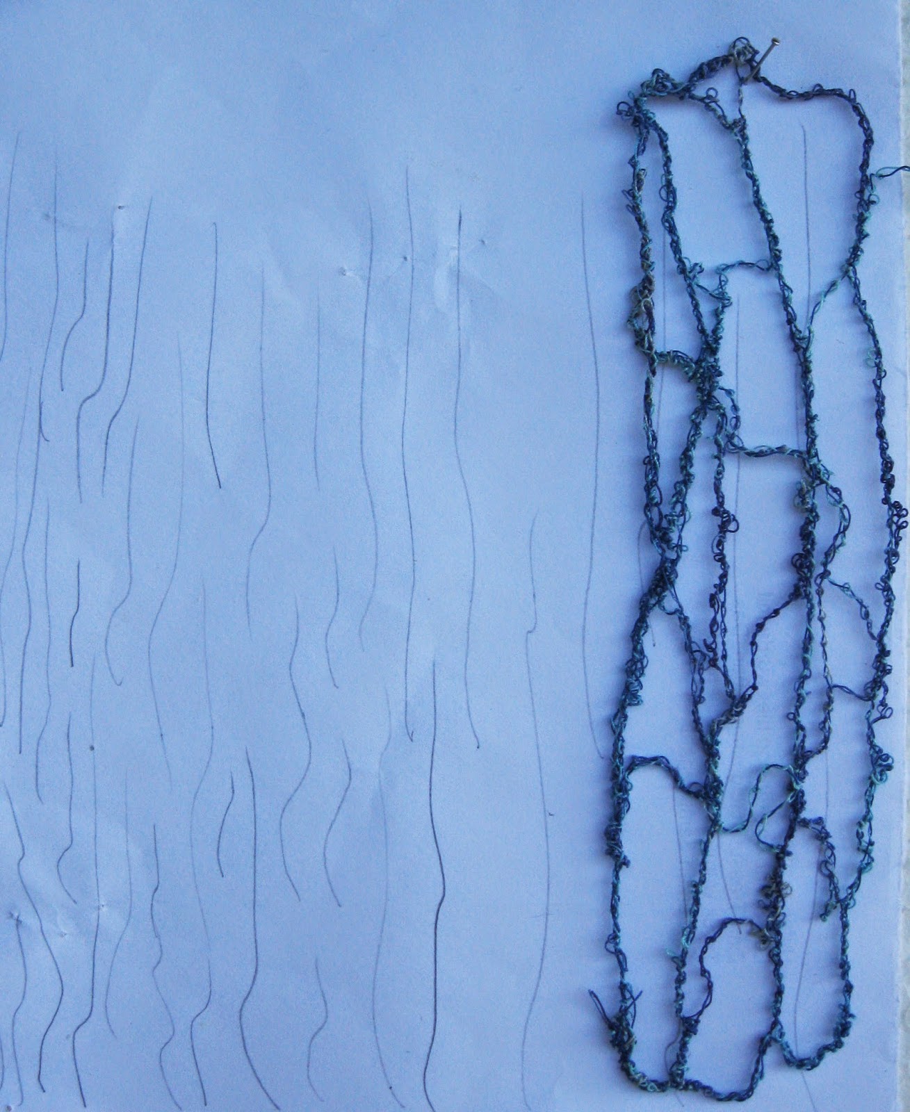
Here are my collected ideas for finding my design. I have drawn a tailfin to demonstrate the similarity of this design  to a ginkgo leaf.
My blue plastic net demonstrates the plastic waste in our seas.
The two round stones which I found in Wales obtained their form by abrasion on the way to the beach.
I painted the beach by acrylic paint and I positioned shells, a plastic net, stones and driftwood on it.
The two drawings in the middle of the picture are the starting point of my story line. A line can be straight or wavy which can be subdivided into different forms. Walsong is transformed in a graphical way. Wales communicate over thousands of miles by these songs. This kind of communication is a part of their social network. Waves are almost everywhere.


Picture 71 and 72:
Design exercises; in black paper to the words in this chapter. I have ripped, cut, manipulated different kind of black paper to reflect the meaning of my words.


Sonntag, 12. Oktober 2014

Chapter 7:
Use of dissolvable "fabrics":

I have used different sorts of dissolvable fabrics. The shrinking process varies one by one "fabric".


Picture 62:
8 small patches using different machine stitches. I have used your numbers from 1 to 14 for my little exercises.
Exercise 1: 1-8-15
Exercise 2: 2-4-5
Exercise 3: 2-8-6-3
Exercise 4: 2-3-6-15
Exercise 5: 2-4-6-8
Exercise 6: 2-3-7-12
Exercise 7: 2-5-13
Exercise 8: 2-3-7
As you can see the results are very different- sometimes better, sometimes less.


Soluble lace samples based on sea and my drawings:
Picture 63:
I worked with different types of yearns also to create reflections (metallic yearn) in long zig-zag lines with straight stitches.


Picture 64:
I used for this sample adhesive Wash-Away. I layed thick yearn on adhesive surface and I covered with a second layer dissolvable fabric. I sewed over this grid to get a connection with the yearns.


Picture 65:
I used the same technic, but I used strips of organza and I connected these strips with sewing circles.


Picture 66:
I created dots to illustrate bubbles of air in the water.


Picture 67:
To get short and long wavy lines  I used straight stitches and I put these together with a small zig-zag stitch.


Picture 68:
For this sample I have used a twin needle and wipstitch. The swirles are not good recognizable, because I missed the cross points and after I have dissolve  these pieces fell apart.


Picture 69:
After this disappointing result I needed a success. I painted a paper and made a stemp in ammonite shape. This form has a long history and I find this shape very beautiful. I stemped on my paper and sewed on dissolvable fabric. I cut out the ammonite shape to create this paper.

Dienstag, 7. Oktober 2014

Chapter 6:
Cutwork:


Picture 54:
To be able to make cutwork I have to put several layers of fabrics on each other. Each layer is stitched to make texture. This picture shows the aluminium foil  and than the blue dyed fabric was stitched in long elipse forms and wavy lines.


Picture 55:
The third layer  was made of two layers blue Organza, processed with hot tool and than it was placed on the prepared layer of picture 54,  sewed together with whip stitch.


Picture 56:
The first and the second layer can be seen on picture 53 . Picture 56 and 57 are a replication of this fabric, which is the second layer. The third layer is Organza.


Picture 57:


Picture 58:
On the third layer I have sewed swirrels and cut partly away to get waves on the ocean.


Picture 59:
Here is my dyed and sewed fabric. This is my first layer.


Picture 60:
The second layer was sewed with an all over meandering. I left different parts free to cut the fabric away.


Picture 61:
This exercise consists of two layers. The first layer was sewed in long zig-zag straight lines in different blues and shiny silver. The second layer is cheese cloth with zig-zag stitches sewed and than partly cut away.